Blaise Brand System
A premium control-plane brand: precise, calm, and unmistakably Blaise.
The Blaise visual system uses the locked gradient-B logo, a blue-to-blue signature, executive slate surfaces, clean typography, and product visuals that show operating intelligence instead of generic security decoration.
Live Trust Center
Proof, continuously verified
Shareable · token-gated · access logged
MFA
Verified 2 hours ago
Backups
Tested nightly
Evidence
128 artifacts on file
Logo system
One logo, clear roles for every asset.
Primary logo

The official logo is the gradient/cyan B mark plus the Blaise wordmark. It appears in the site header, app chrome, public portals, documents, decks, and executive-facing surfaces.
Light surface variant

Use a clean white plate when the surface is busy, deeply saturated, or when the logo needs a restrained executive presentation moment.
Color palette
The signature is blue to ice-blue, supported by a calm executive shell.
Blaise Blue
#1e6fff
Primary identity, premium CTA start, hero accents
Ice Blue
#47bfff
Intelligence accent, CTA end, active states
Deep Blue
#2563eb
Depth, premium gradients, dark-mode emphasis
Executive Ink
#111827
Primary text and quiet executive UI
Executive Muted
#5b6472
Secondary text and descriptive copy
Executive Shell
#08111f
Dark hero, product theater, social/OG shell
Executive Surface
#ffffff
Cards, panels, and clarity-heavy content
Subtle Surface
#f8fafc
Page bands and calm background sections
Primary CTA treatment
Use the blue-to-blue gradient for primary action and identity emphasis. Keep most content surfaces white or near-white, and reserve signal colors for actual status.
Typography
Precise, modern type for executive confidence.
Type roles
Inter supports dense product UI, operational content, labels, metadata, and forms.
Plus Jakarta Sans is reserved for stronger headings, hero moments, and executive presentation surfaces.
Large display type belongs in heroes, board summaries, report covers, and executive decision views.
Operational areas stay compact, scannable, and calm.
Scale sample
Run the whole executive technology program.
Board-ready assurance from live evidence.
Body copy stays direct and useful, with enough air for a premium B2B page and enough density for serious buyers.
Eyebrows are compact, uppercase, and used sparingly
Core components
Buttons, cards, badges, and product theater should feel like one system.
Blaise UI is organized around crisp cards, restrained borders, clear focus states, and visual product evidence. Cards are stable on hover: polish without layout shift.
Badge
Executive control planeMetric card
100+
Frameworks cross-mapped
Product panel
Connect
18+ live collectors
Map
SCF control spine
Report
Board-ready outputs
Constellation motif
The constellation is a marketing graphic, not the core logo.
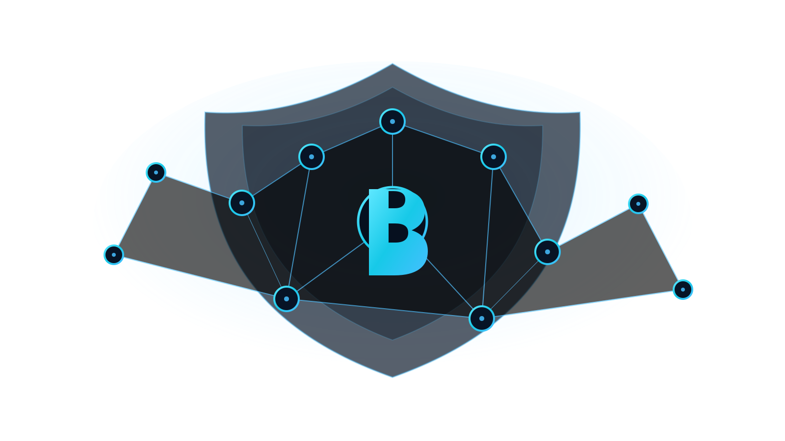
Use for story
The constellation graphic communicates one control plane connected to many capabilities, signals, and stakeholders.
Do not use as logo
It is too detailed for small sizes. Keep it for hero visuals, section backgrounds, and social/OG storytelling.
Let product visuals lead
Marketing imagery should show actual operating intelligence: scorecards, trends, risks, roadmaps, evidence, and decisions.
Build the stakeholder story before the meeting starts.
See how Blaise turns posture, risk, evidence, vendors, roadmap, and decisions into a board-ready operating rhythm.